Branding creation & packaging
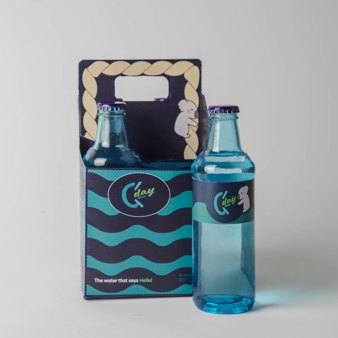
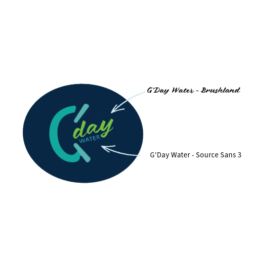
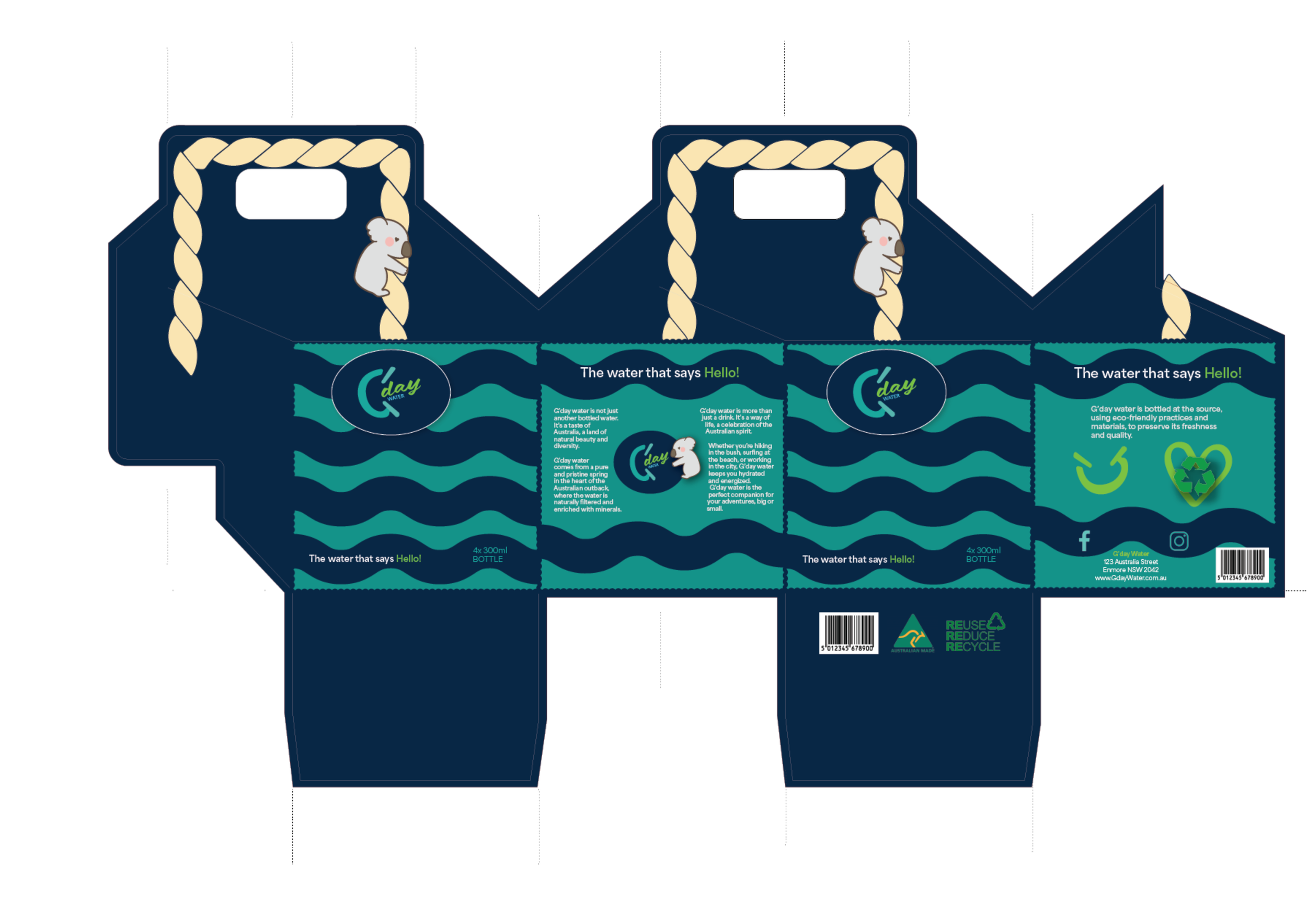
G’day Water’s Logo can evoke a strong connection to nature, reflecting the brand’s commitment to purity and environmental consciousness.
These colors are reminiscent of the Australian landscape, from the lush greenery of the rainforests to the clear blue skies and the inviting aqua of the ocean.
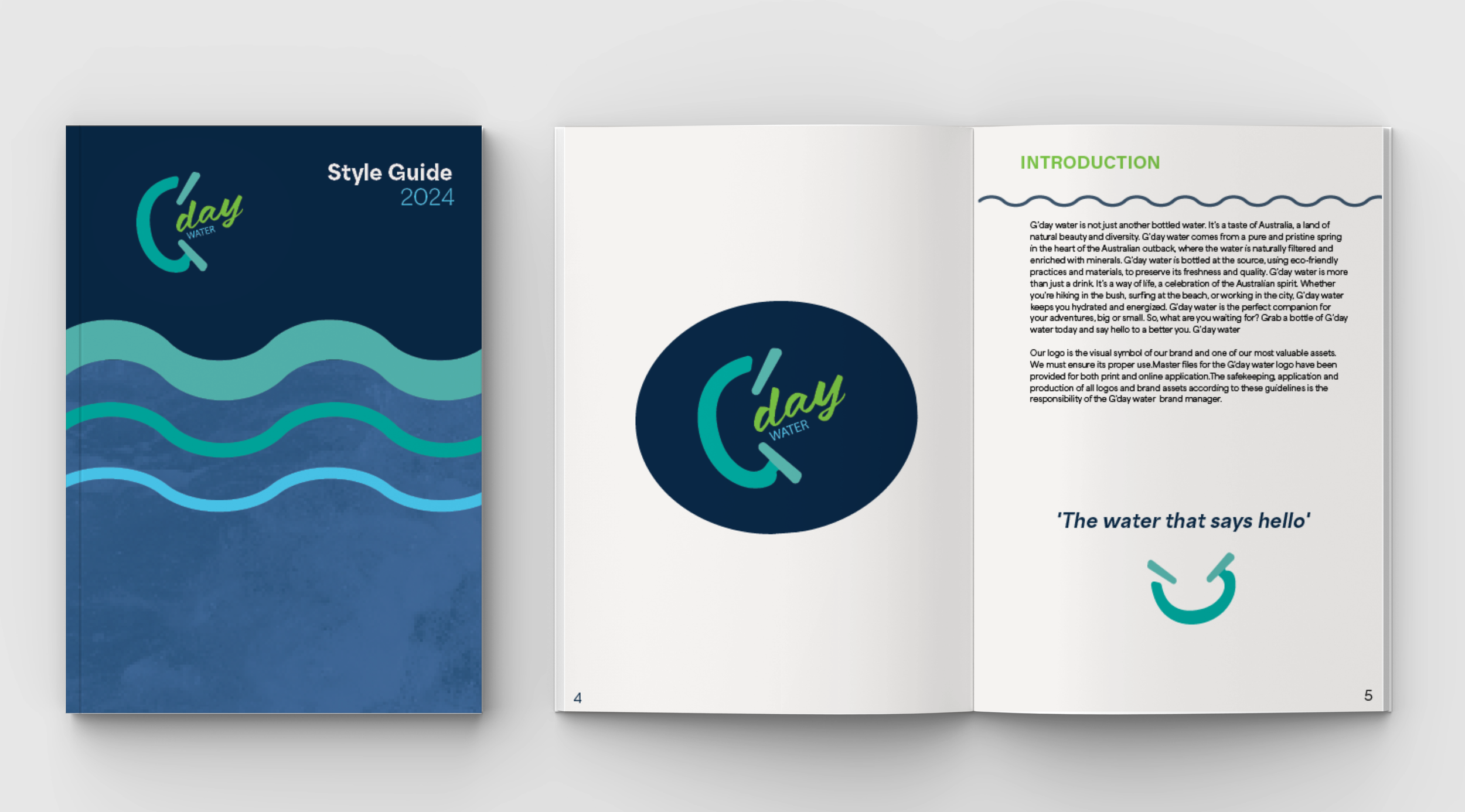
G’Water, Water that says hello!
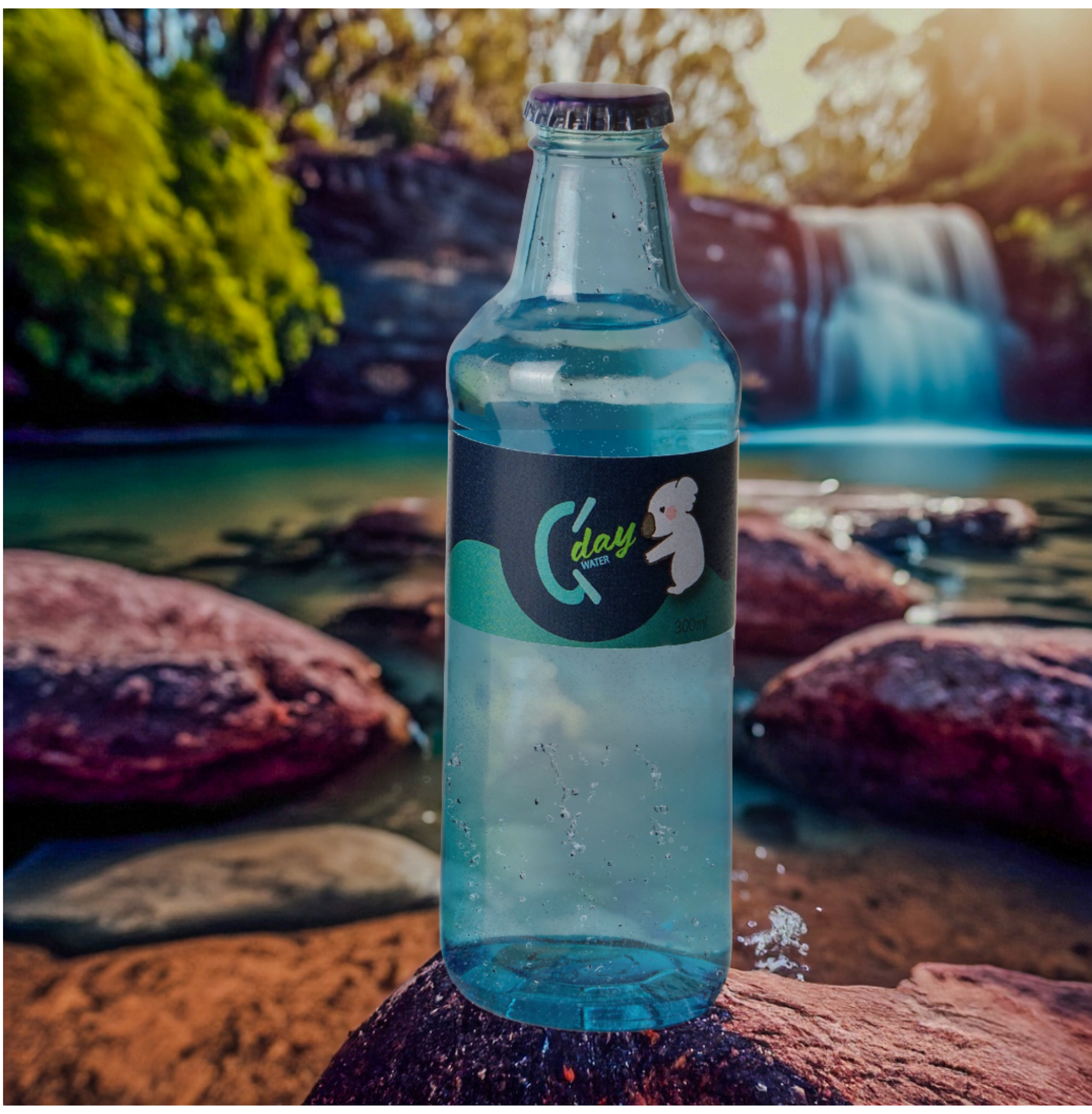
G'day water isn't just another bottled water; it's a taste of Australia's natural beauty and diversity. Sourced from a pristine spring in the Australian outback, G'day water is naturally filtered and enriched with minerals. Bottled at the source using eco-friendly practices, it promises purity and quality with every sip
More than just a drink, G'day water embodies the Australian spirit. Whether you're exploring the bush, surfing at the beach, or navigating city life, it keeps you hydrated and energized. G'day water is your perfect companion for all adventures, big or small. So, grab a bottle today and embrace a better you!
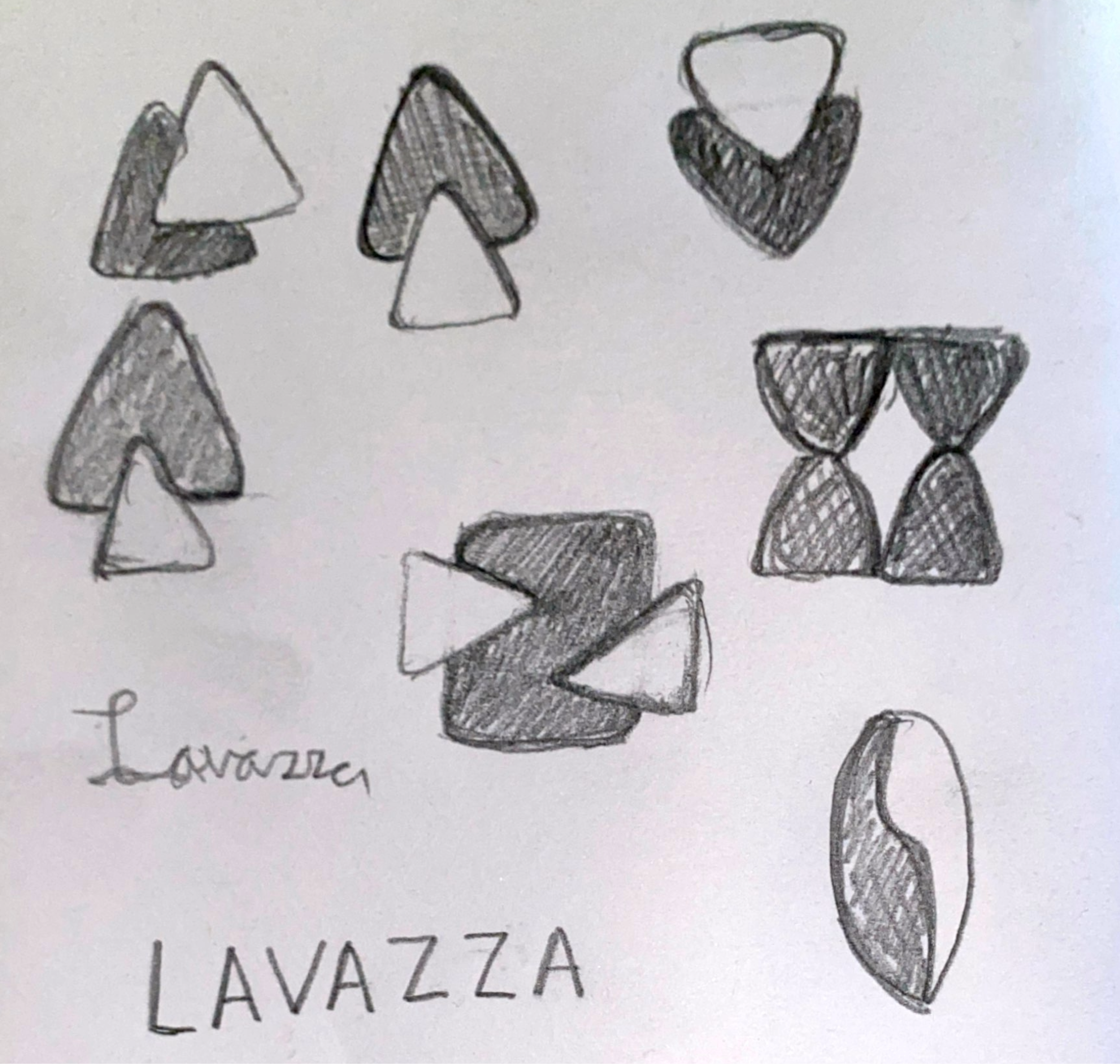
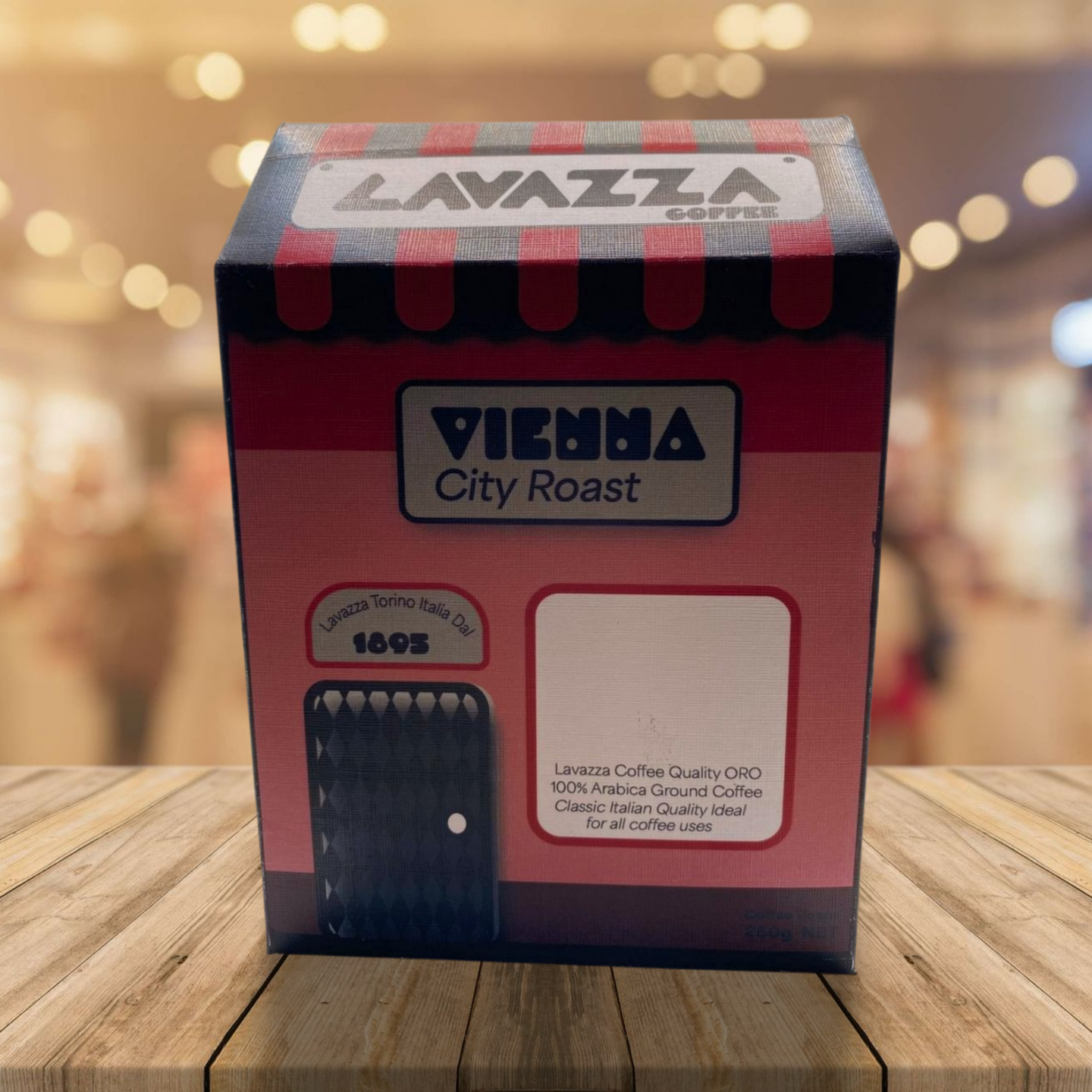
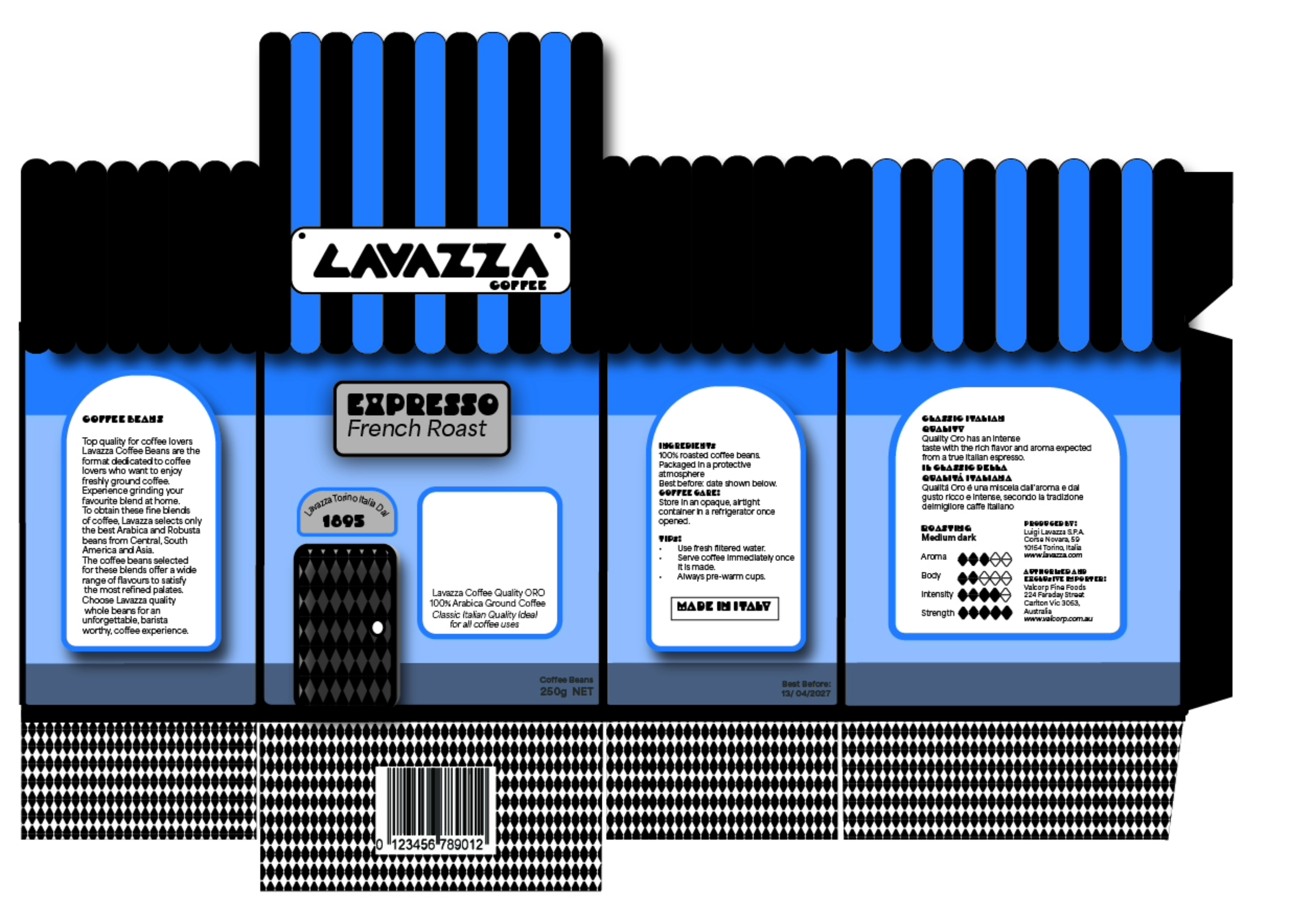
Lavazza Rebranding & Ground Coffee package
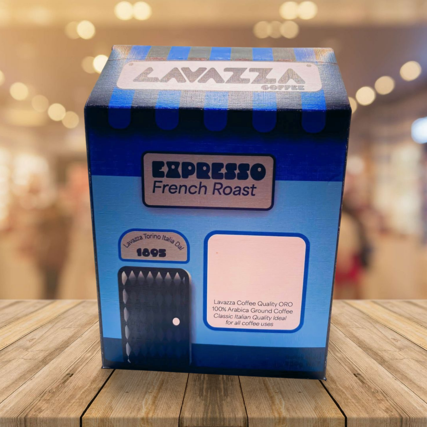
Designing Lavazza coffee bean packaging inspired by small coffee shops can create a strong connection between the product and the cozy atmosphere that coffee enthusiasts love. Small coffee shops emphasize a warm, inviting ambiance with unique, artisanal touches that reflect the local culture and community. This approach aligns with Lavazza's commitment to quality and tradition, making the packaging a part of the overall coffee experience.
Lavazza's target market, discerning coffee drinkers who appreciate premium quality and rich flavors, would be drawn to this design. Packaging that reflects the charm and character of small coffee shops can resonate with their desire for authenticity and connection. It also highlights Lavazza's dedication to sourcing and crafting exceptional coffee, reinforcing the brand's reputation for excellence. This strategy can enhance Lavazza's appeal by tapping into current trends in coffee culture, fostering a deeper emotional connection with its customers.
Paper swatch sample & Packaging
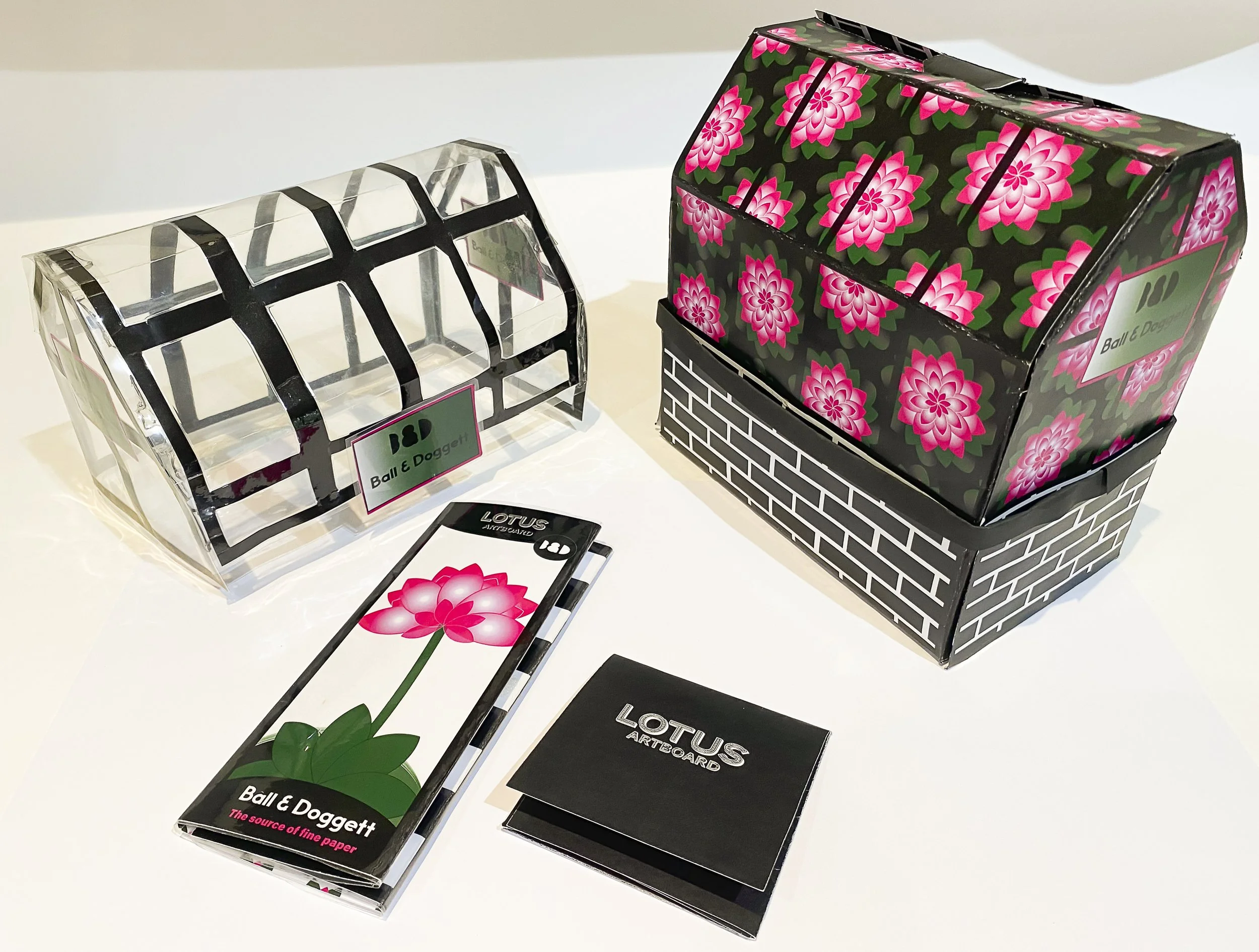
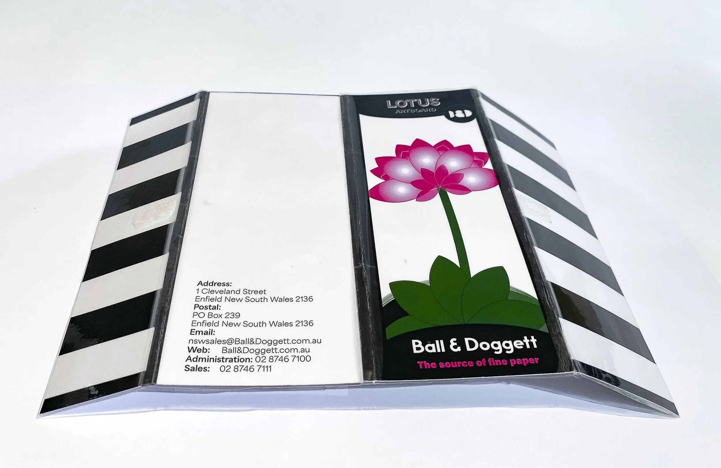
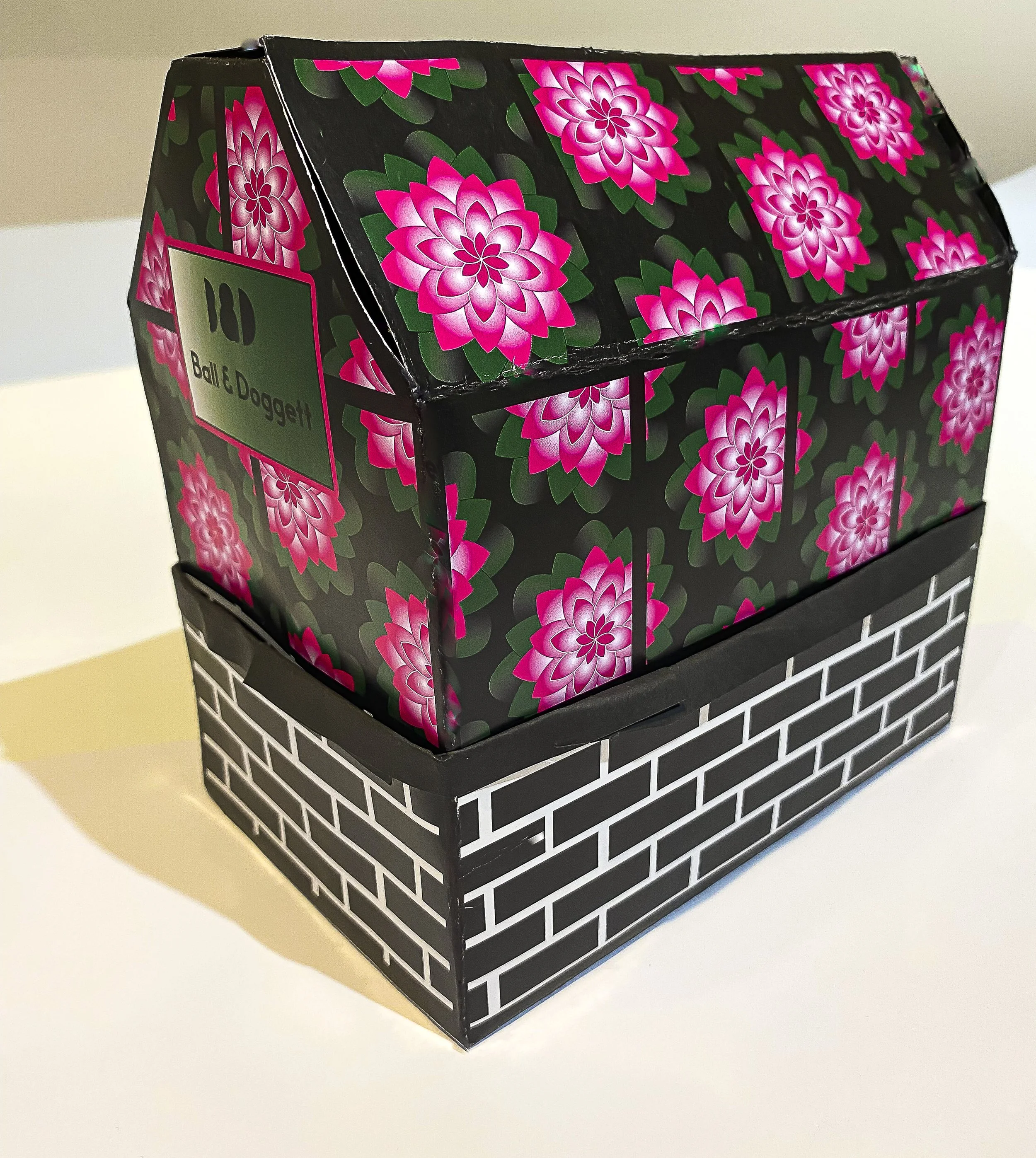
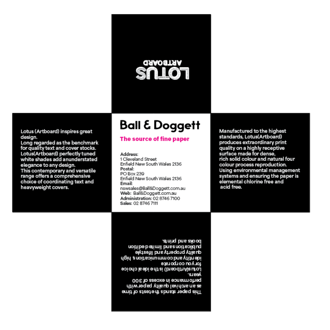
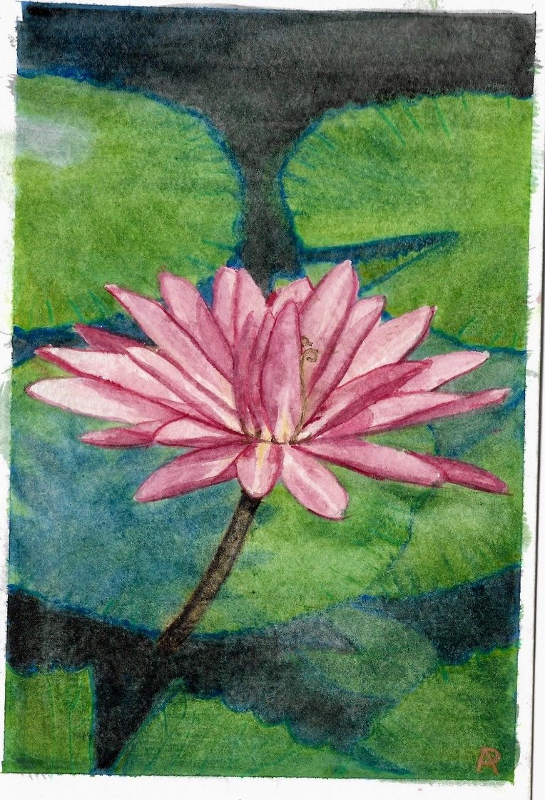
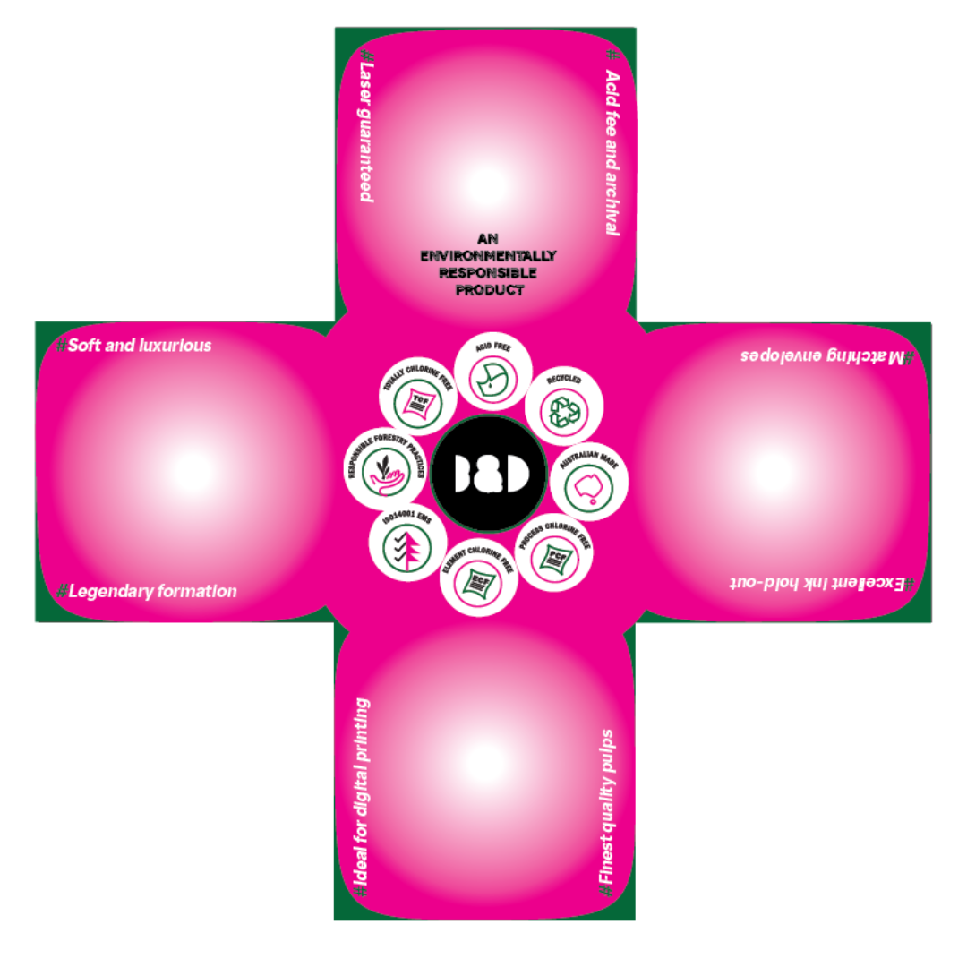
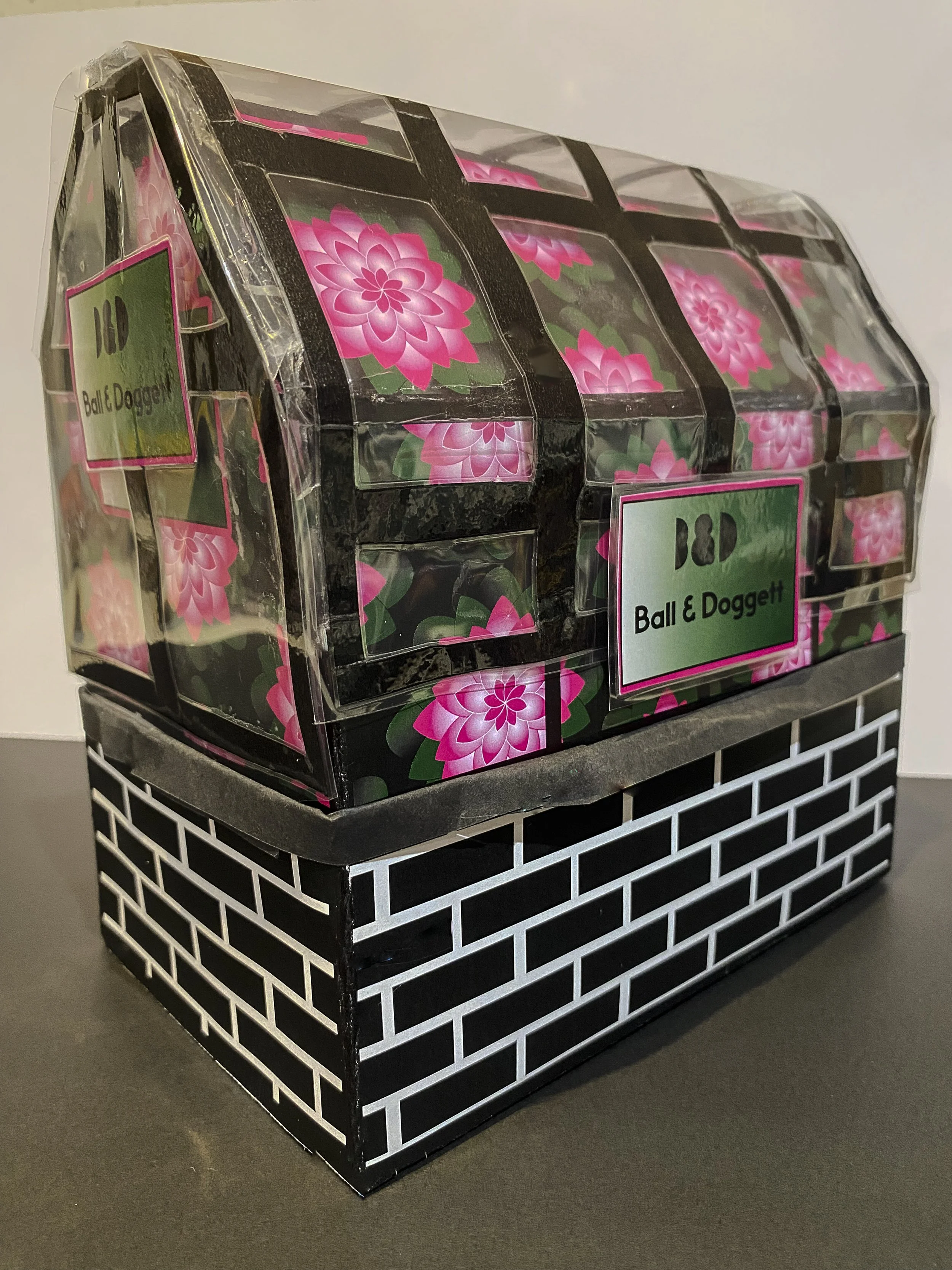
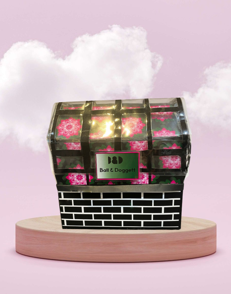
I selected my Ball and Doggett paper swatch sample, Lotus (Art Board), inspired by a watercolor painting I created of a pink lotus. My concept was to design a package that embodies the rarity and sacredness of the lotus. Since the lotus is a plant, I aimed to create packaging reminiscent of an actual lotus flower, leading me to the idea of a greenhouse design.
I want the recipient to feel as though they are receiving a beautiful gift to open. The experience should combine the joy of purchasing high-quality art paper with the elegance of the lotus, coming together seamlessly. Designers will appreciate this package for its thoughtful integration of high-quality art paper, the sacred symbolism of the lotus, and the innovative greenhouse design, creating an enchanting and inspiring unboxing experience.


